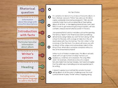
At the top, there is a clean navigation bar with all the main pages., On the left, we have a sidebar with filters to help users find the right course., In the middle of the screen, there is a grid of course cards., In the upper-left corner, there is the company logo, which links back to the homepage., In the upper-right corner, there are search and profile icons, and a cart., At the bottom of each card, there is a bright blue CTA button., At the very bottom, there is a red footer with all the legal documentation., On the right, we have filters for levels and interests so the user can sort the content., If you scroll down, there is an accordion menu for FAQ below the main section., Inside the red footer, there are social media links for Instagram and YouTube., The company logo is in the upper-left corner of the header., A clean navigation bar is at the top, so it’s very easy to see., Search and profile icons are in the upper-right corner next to the user balance., A sidebar with filters is on the left side of this layout., Filters for levels and interests are on the right in the mobile version of the app., A grid of course cards is in the middle, right under the main banner., Inside the card, the price tag is at the bottom, right next to the button., The main CTA button is in the bottom-right corner of the screen., An accordion menu for FAQ is at the bottom of the homepage., A red footer and social media links are at the very bottom of the webpage.
0%
3.2
שתף
שתף
על ידי
Englishnastiia
עריכת תוכן
שמור
אהבתי
הדפסה
הטבעה
עוד
הקצאות
לוח תוצאות מובילות
הצג עוד
הצג פחות
לוח התוצאות הזה הוא כרגע פרטי. לחץ
שתף
כדי להפוך אותו לציבורי.
לוח תוצאות זה הפך ללא זמין על-ידי בעל המשאב.
לוח תוצאות זה אינו זמין מכיוון שהאפשרויות שלך שונות מאשר של בעל המשאב.
אפשרויות חזרה
בטל את הערבוב
היא תבנית פתוחה. זה לא יוצר ציונים עבור לוח התוצאות.
נדרשת כניסה
סגנון חזותי
גופנים
נדרש מנוי
אפשרויות
יותר כמו זה
On Screen B1 - Module 4 - Social Media
על ידי
Jpatadel
התאמה
6
Right or wrong? Get to the Top 1 Module 4
על ידי
Naszgyongyi
אמת או שקר
8
Review- layout
על ידי
Christina74
דיאגרמה עם תוויות
7
Let's talk UX design
על ידי
Mariasher
קלפים אקראיים
3
Roadmap A2+ (2D. Show interest and excitement)
על ידי
Englyspace
קלפים אקראיים
8
Roadmap B1 - 4D: English in action
על ידי
Libraryjcl
גלגל אקראי
4
Roadmap B1 + - 6D: English in action
על ידי
Eireneii
חידון
3
Revision (Welcome) TOP GOAL
על ידי
Salwaalhajrii
פתח את התיבה
13
החלף תבנית
הצג הכל
תוצאות פתוחות
העתק קישור
קוד QR
מחיקה
האם לשחזר את הנתונים שנשמרו באופן אוטומטי:
?